A simple loading animation component in Vue.js
05 Oct 2022 - Help improve this postWhat to do if you want a simple SVG loading circle. You can do it with a div in HTML, but the positioning of the element is always a bit annoying.
That’s why I created a simple component in Vue that works easier. This is how the component loader (only the loading circle) looks like:

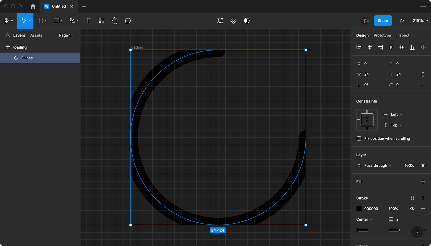
I needed rounded corners on the circle ends, so I’m stuck with a svg stroke. It’s not the best to work with, but better than a fill path. I draw a cicle in Figma and removed one of the points to create a circle with a part missing:
This produced the following SVG:
<svg
  width="24"
  height="24"
  viewBox="0 0 24 24"
  fill="none"
  xmlns="http://www.w3.org/2000/svg"
>
  <g clip-path="url(#clip0_7_26)">
    <path
      d="M24 12C24 18.6274 18.6274 24 12 24C5.37258 24 0 18.6274 0 12C0 5.37258 5.37258 0 12 0"
      stroke="black"
      stroke-width="2"
      stroke-linecap="round"
    />
  </g>
  <defs>
    <clipPath id="clip0_7_26">
      <rect width="24" height="24" fill="white" />
    </clipPath>
  </defs>
</svg>
After cleaning up the clip paths it looks like this:
<svg
  width="24"
  height="24"
  viewBox="0 0 24 24"
  fill="none"
  xmlns="http://www.w3.org/2000/svg"
>
  <path
    d="M24 12C24 18.6274 18.6274 24 12 24C5.37258 24 0 18.6274 0 12C0 5.37258 5.37258 0 12 0"
    stroke="black"
    stroke-width="2"
    stroke-linecap="round"
  />
</svg>
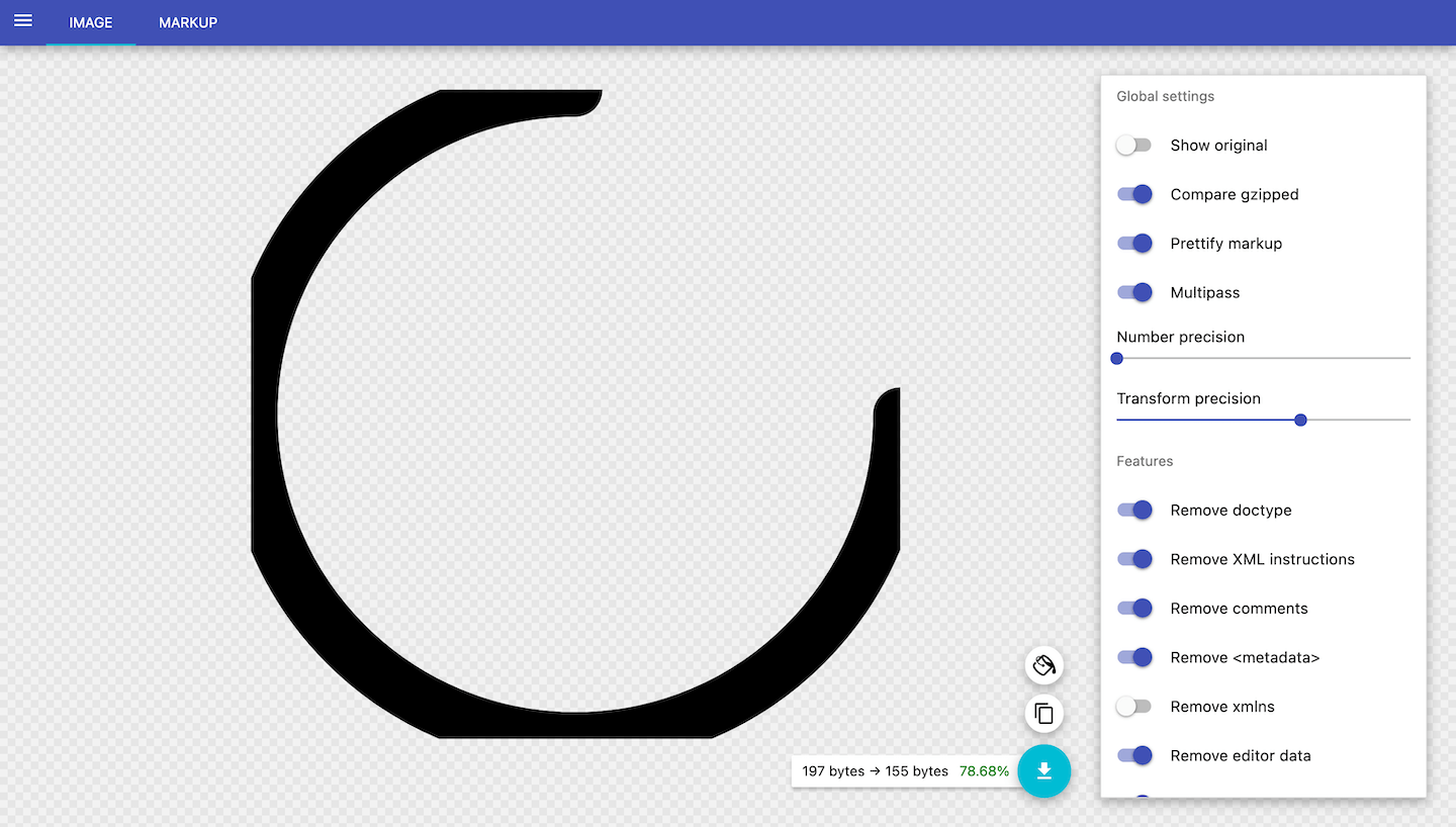
Then I passed it to SVGOMG to do more clean up:
Now I have this:
<svg xmlns="http://www.w3.org/2000/svg" fill="none" viewBox="0 0 24 24">
  <path stroke="#000" stroke-linecap="round" stroke-width="2" d="M24 12A12 12 0 1 1 12 0"/>
</svg>
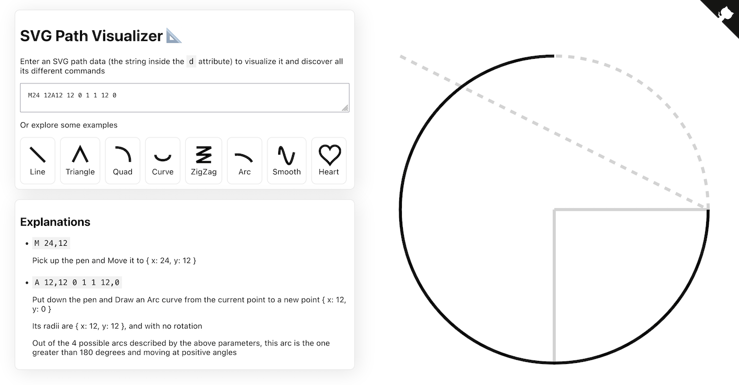
To get a better understanding of what those paths look like, use svg-path-visualizer.netlify.app.
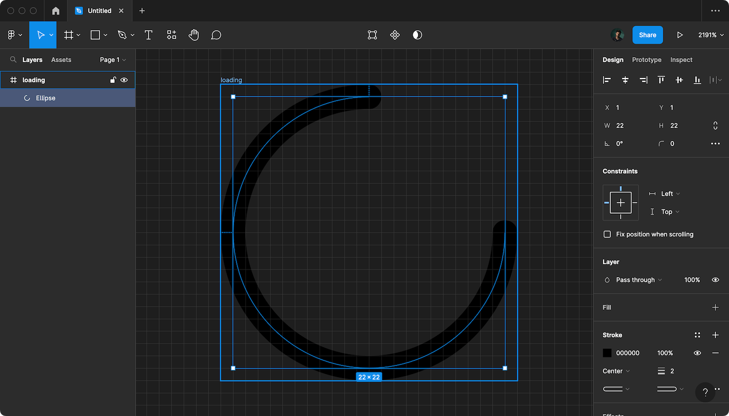
In Figma I also created an image of an circle with a border of 2px that would fit in the 24 x 24px view box:
When you compare both SVG outputs, and look at the d in path, the differences are easy to spot:
M24 12A12 12 0 1 1 12 0 (no border)
M23 12A11 11 0 1 1 12 1 (2px border)
M24 becomes M23 (24 - border width / 2), the same goes for A12 12, it becomes A11 11 (12 - border width / 2), and the last number becomes (border width / 2).
After that it was easy to create a Vue component out of this:
<template>
  <svg xmlns="http://www.w3.org/2000/svg" fill="none" viewBox="0 0 24 24">
    <path
      :stroke="color"
      stroke-linecap="round"
      :stroke-width="border"
      :d="path"
    />
  </svg>
</template>

<script>
export default {
  name: "Loader",

  props: {
    border: {
      type: Number,
      default: 2,
    },
    color: {
      type: String,
      default: "#ff4f64",
    }
  },

  computed: {
    path() {
      const delta = this.border / 2;

      const radius = 12 - delta;
      const startX = 24 - delta;
      const endX = delta;

      return `M${startX} 12A${radius} ${radius} 0 1 1 12 ${endX}`;
    },
  },
};
</script>

<style scoped>
@keyframes rotate {
  0% {
    transform: rotate(0deg);
  }
  20% {
    transform: rotate(50deg);
  }
  80% {
    transform: rotate(310deg);
  }
  100% {
    transform: rotate(360deg);
  }
}

svg {
  animation: rotate 1.8s linear infinite;
}
</style>
I played a bit with a rotating animation, but it’s totally redundant.
Happy coding! – Found a mistake or a typo? Please submit a PR to my GitHub-repo.